Hello There!

Lorem ipsum dolor sit amet, consectetur adipiscing elit,

Secure Returns, Made Simple.

Overview

Background

In this project, I focused on creating a Government Bonds experience for Tuntun, an investment platform in Indonesia. Bonds are considered safe and stable, yet for many retail investors, they feel intimidating, complex, and inaccessible.

Challenge

bonds are traditionally seen as complex, fragmented, and intimidating. My goal was to make them transparent, beginner-friendly, and simulation-driven, all while fitting into Tuntun’s product ecosystem.

Role

Beyond UX

At Tuntun, our lean team required designers to take on multiple hats—research, product strategy, and execution.

Responsibilities

- 15 user interviews (existing Tuntun users)
- 50 survey responses
- 1:1 usability tests with 8 participants
- Desk research & benchmarking

Problem Discovery

User Survey & Interview

To better understand how retail investors in Indonesia perceive and interact with government bonds, we conducted a mixed-method study combining a survey of 20+ participants and 8 in-depth interviews.

Benchmark App

The benchmark shows that existing platforms in Indonesia prioritize transactional execution over user education and transparency. This opens the door for a differentiated approach: a clarity-first, simulation-driven, and supportive bond experience that reduces intimidation and builds long-term trust.

Journey Mapping

Before designing the Government Bonds feature, we needed to understand the end-to-end experience of retail investors. Bonds are not only financially complex but also involve multiple touchpoints banks, financial apps, manual spreadsheets, and even offline steps.

Key Findings

Based of all the resarch heres the 3 key findings of bond app

Bonds feel too complicated

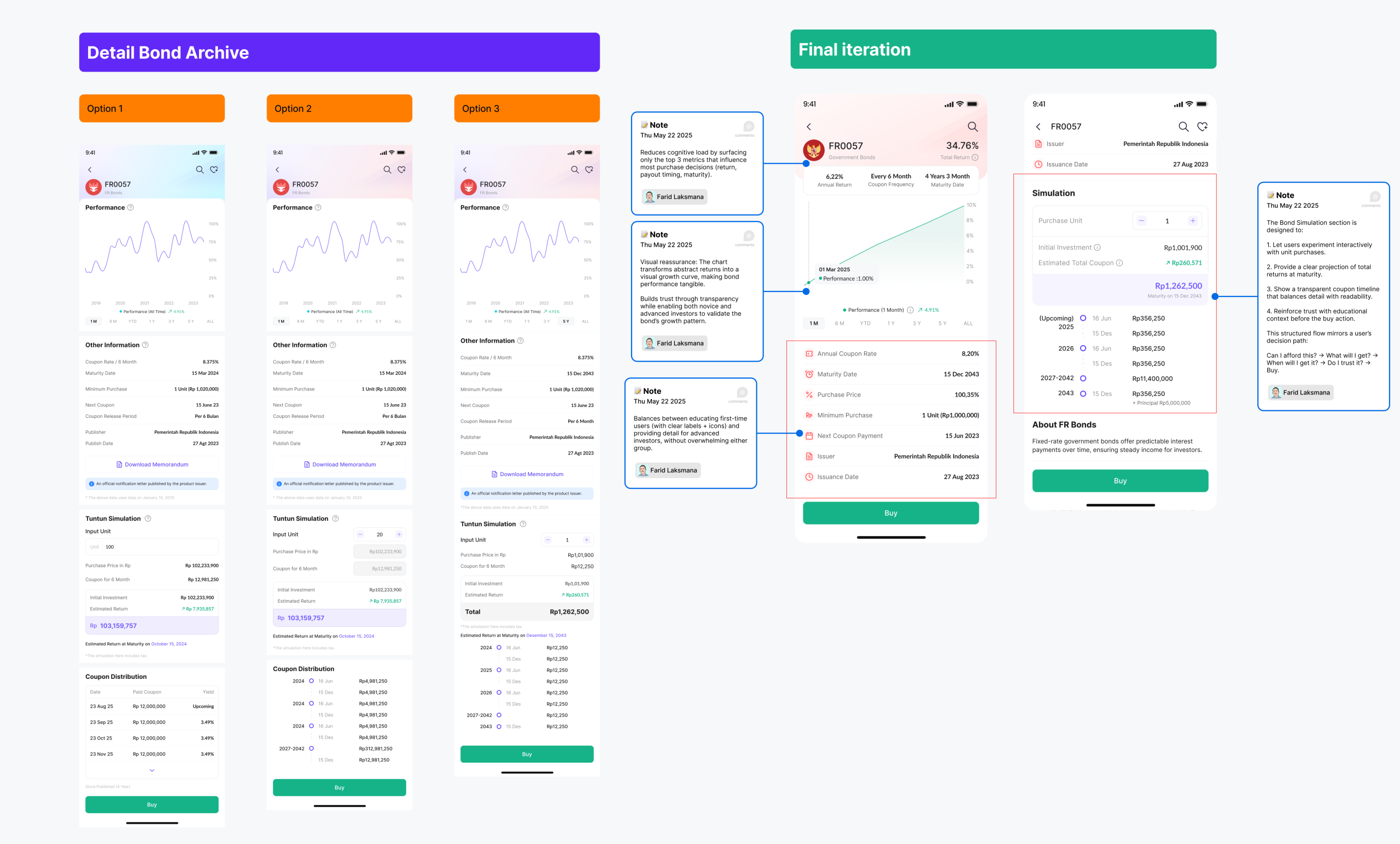
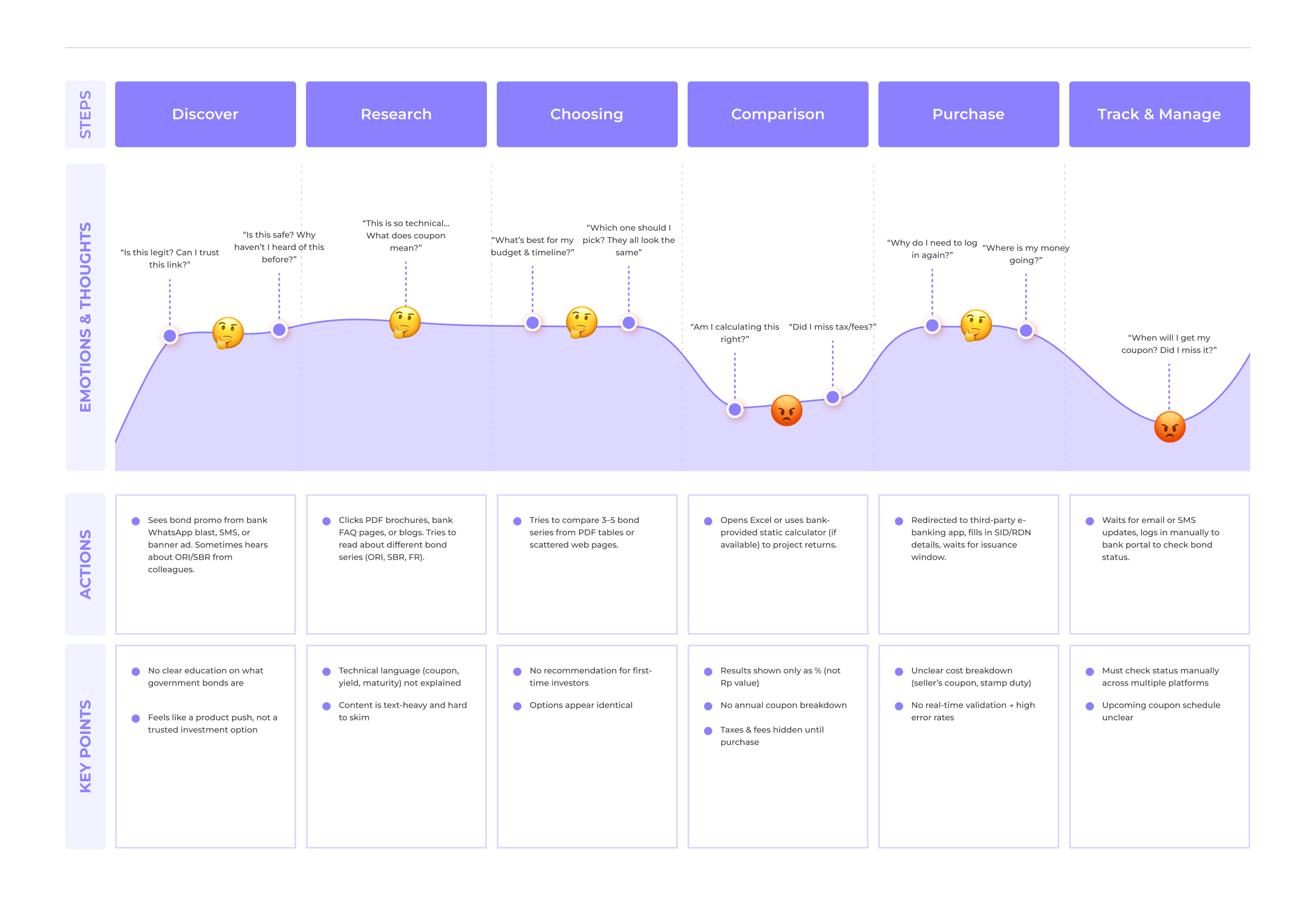
Users struggled with jargon: coupon, yield, settlement, liquidity. Result → hesitation & drop-off.

Fragmented purchase flows

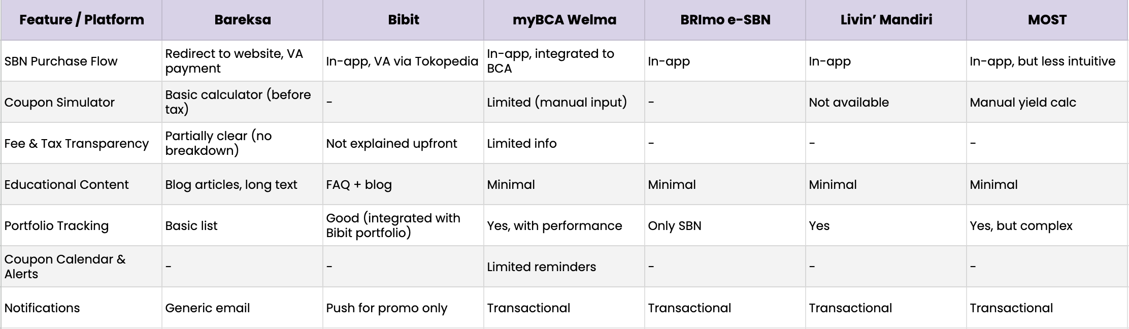
Other apps force users through multiple redirects (bank + RDN + government site). Result → frustration, high abandonment.

No real return simulation

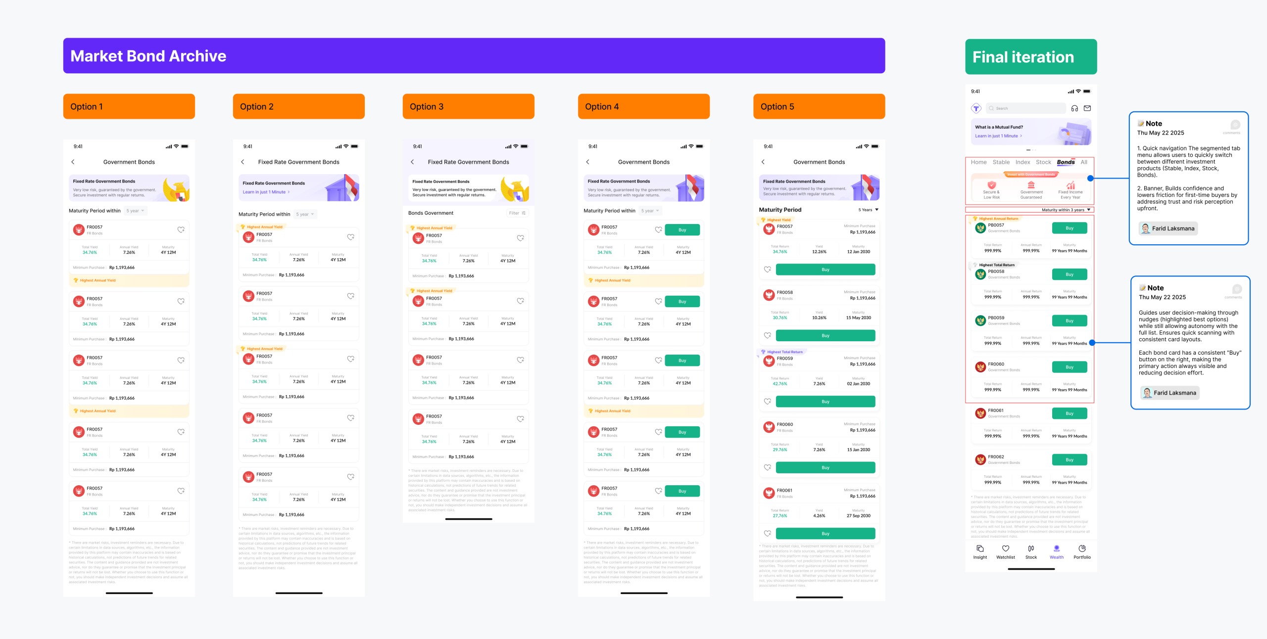
Other platforms only show a flat % yield, leaving users confused about actual payouts.

Problem Statement

HMW

Government bonds are often perceived as complex and intimidating. Users struggle with jargon, face fragmented purchase flows, and lack tools to clearly understand real returns. To address this, we reframed the challenges into key How Might We (HMW) questions:

“How might we design a government bond experience that is clear, trustworthy, and aligned with users’ existing mental models, while ensuring regulatory compliance and driving adoption in Tuntun’s ecosystem?”

Design Discovery

Jobs to be done

Rina (32, Civil Servant): Risk-averse, prefers deposits, confused by bond terms.

Dimas (28, Employee): Tech-savvy, curious, but can’t calculate real returns.

UX Strategy

Clarity-first: No jargon walls
Trust-centered: Official badges, transparent costs
Simulation-driven: Real outcomes first, not abstract %
Mental model fit: Mimic deposit purchase flow for familiarity

Glimps Of Exploration

heres the exploration

Design Concepts

Discover

We began with discovery. Since most retail users don’t wake up thinking, “I want to buy government bonds today”, visibility was key. That’s why bonds were surfaced in two entry points: a homepage banner for casual browsers and a dedicated tab for power users. The banner drew immediate attention, while the tab served those who prefer navigating by category. In testing, this mix proved effective CTR from the banner reached 14.2%, showing how awareness can drive adoption.

Government bonds differ mainly in term and yield. Showing annualized return helps compare across varying maturity dates and face values.

Product Detail Page

The next step was learning. Bonds are jargon-heavy, and misunderstandings can easily lead to disappointment. Many users, for example, confuse coupon rate with interest or capital gain. To tackle this, the detail page introduced glossary tooltips and progressive disclosure. Instead of overwhelming with dense paragraphs, information appeared in layers, triggered by curiosity. This supported recognition over recall, letting users build knowledge at their own pace while reducing cognitive load.

Government bonds differ mainly in term and yield. Showing annualized return helps compare across varying maturity dates and face values.

Simulation

After learning came simulation, where we addressed the biggest gap: understanding returns. Unlike mutual funds, bond payouts are predictable but involve a formula that most first-time investors can’t calculate intuitively. We built an interactive simulator where users could adjust investment amounts and immediately see projected coupon payouts. This dynamic feedback encouraged exploration and gave a clear picture of future income, helping transform abstract percentages into tangible cash flow.

Government bonds differ mainly in term and yield. Showing annualized return helps compare across varying maturity dates and face values.

Buy

From there, users moved to the purchase flow. This was a critical stage where trust could easily collapse if costs felt hidden or steps seemed confusing. To counter this, we structured the process as a stepped UI, validating key requirements like SID, RDN, and available funds along the way. Costs stamp duty, taxes, and final price were broken down transparently, avoiding unpleasant surprises. Disabled CTAs reinforced safe action principles, guiding users only when requirements were met, and reducing anxiety at the moment of commitment.

Government bonds differ mainly in term and yield. Showing annualized return helps compare across varying maturity dates and face values.

Portfolio

Finally, ownership needed to feel rewarding. In the portfolio view, we shifted focus away from price volatility, relevant for stocks, but not bonds and toward income. The dashboard highlighted total invested, net return, and upcoming coupons. A simple payout calendar reinforced the bond’s nature as a reliable income instrument, closer to a time deposit than a stock. This not only matched users’ mental models but also encouraged reinvestment decisions by making liquidity more visible.

Government bonds differ mainly in term and yield. Showing annualized return helps compare across varying maturity dates and face values.

Impact

Usability App

Clarity-first: No jargon walls
Trust-centered: Official badges, transparent costs
Simulation-driven: Real outcomes first, not abstract %
Mental model fit: Mimic deposit purchase flow for familiarity

SUS

Clarity-first: No jargon walls
Trust-centered: Official badges, transparent costs
Simulation-driven: Real outcomes first, not abstract %
Mental model fit: Mimic deposit purchase flow for familiarity

Learning Point

Impact

Simulator-first approach: changed user perception from “confusing” to “empowering.” Clarity over cleverness: plain language won trust. Research-backed design: every step mapped to behavior science & finance logic.

Lessons Learned

- Transparency is the strongest UX tool in financial design.

- Aligning with users’ existing mental models reduces learning curve.

- Simulation drives both understanding and conversion.

Say hello at:

Stalk us

All rights reserved — 2025 ©