This case study explores how I designed a Government Bonds feature for Tuntun a retail investment platform in Indonesia.
Challenge
bonds are traditionally seen as complex, fragmented, and intimidating. My goal was to make them transparent, beginner-friendly, and simulation-driven, all while fitting into Tuntun’s product ecosystem.
02. Learning Brief
Beyond UX
At Tuntun, our lean team required designers to take on multiple hats—research, product strategy, and execution.
Responsibilities
- 15 user interviews (existing Tuntun users)
- 50 survey responses
- 1:1 usability tests with 8 participants
- Desk research & benchmarking
Image
Image
03. Defining UI Guidelines
Before designing the Government Bonds feature, we needed to understand the end-to-end experience of retail investors. Bonds are not only financially complex but also involve multiple touchpoints banks, financial apps, manual spreadsheets, and even offline steps.
No real return simulation
Other platforms only show a flat % yield, leaving users confused about actual payouts.
Solution: Built a visual simulator: annual coupon timeline, after-tax breakdown, total net return.
04. Building the Skeleton
Personas
Our personas
Rina (32, Civil Servant): Risk-averse, prefers deposits, confused by bond terms.
Dimas (28, Employee): Tech-savvy, curious, but can’t calculate real returns.
05. High-Fidelity Design
Personas
Our personas
Rina (32, Civil Servant): Risk-averse, prefers deposits, confused by bond terms.
Dimas (28, Employee): Tech-savvy, curious, but can’t calculate real returns.
06. Assets & Handoff
Personas
Our personas
Rina (32, Civil Servant): Risk-averse, prefers deposits, confused by bond terms.
Dimas (28, Employee): Tech-savvy, curious, but can’t calculate real returns.
UX Strategy
Clarity-first: No jargon walls
Trust-centered: Official badges, transparent costs
Simulation-driven: Real outcomes first, not abstract %
Mental model fit: Mimic deposit purchase flow for familiarity
07. Interaction Prototype
Discover
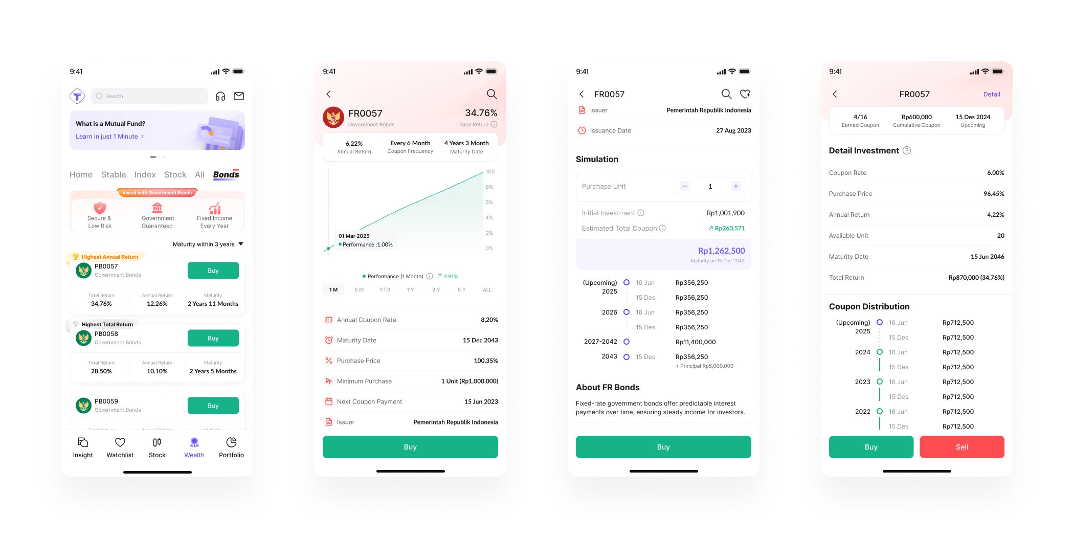
We began with discovery. Since most retail users don’t wake up thinking, “I want to buy government bonds today”, visibility was key. That’s why bonds were surfaced in two entry points: a homepage banner for casual browsers and a dedicated tab for power users. The banner drew immediate attention, while the tab served those who prefer navigating by category. In testing, this mix proved effective CTR from the banner reached 14.2%, showing how awareness can drive adoption.
Government bonds differ mainly in term and yield. Showing annualized return helps compare across varying maturity dates and face values.
Product Detail Page
The next step was learning. Bonds are jargon-heavy, and misunderstandings can easily lead to disappointment. Many users, for example, confuse coupon rate with interest or capital gain. To tackle this, the detail page introduced glossary tooltips and progressive disclosure. Instead of overwhelming with dense paragraphs, information appeared in layers, triggered by curiosity. This supported recognition over recall, letting users build knowledge at their own pace while reducing cognitive load.
Simulation
After learning came simulation, where we addressed the biggest gap: understanding returns. Unlike mutual funds, bond payouts are predictable but involve a formula that most first-time investors can’t calculate intuitively. We built an interactive simulator where users could adjust investment amounts and immediately see projected coupon payouts. This dynamic feedback encouraged exploration and gave a clear picture of future income, helping transform abstract percentages into tangible cash flow.
Buy
From there, users moved to the purchase flow. This was a critical stage where trust could easily collapse if costs felt hidden or steps seemed confusing. To counter this, we structured the process as a stepped UI, validating key requirements like SID, RDN, and available funds along the way. Costs stamp duty, taxes, and final price were broken down transparently, avoiding unpleasant surprises. Disabled CTAs reinforced safe action principles, guiding users only when requirements were met, and reducing anxiety at the moment of commitment.
Portfolio
Finally, ownership needed to feel rewarding. In the portfolio view, we shifted focus away from price volatility, relevant for stocks, but not bonds and toward income. The dashboard highlighted total invested, net return, and upcoming coupons. A simple payout calendar reinforced the bond’s nature as a reliable income instrument, closer to a time deposit than a stock. This not only matched users’ mental models but also encouraged reinvestment decisions by making liquidity more visible.
Learning Point
Impact
Designing financial tools taught us that:
Numbers alone don’t empower—context does.
Transparency drives adoption—users need to trust the logic.
Notifications should respect attention—less frequent, more meaningful.
Lessons Learned
- Transparency is the strongest UX tool in financial design.
- Aligning with users’ existing mental models reduces learning curve.
- Simulation drives both understanding and conversion.