In this project, We focused on creating a Government Bonds experience for Tuntun, an investment platform in Indonesia. Bonds are considered safe and stable, yet for many retail investors, they feel intimidating, complex, and inaccessible.
bonds are traditionally seen as complex, fragmented, and intimidating. Our goal was to make them transparent, beginner-friendly, and simulation-driven, all while fitting into Tuntun’s product ecosystem.
At Tuntun, our lean team required designers to take on multiple hats—research, product strategy, and execution.
- User Surveys
- 1:1 usability tests with 8 participants
- Desk research & benchmarking
- Design UI & prototype
To better understand how retail investors in Indonesia perceive and interact with government bonds, we conducted a mixed-method study combining a survey and in-depth interviews.
The benchmark shows that existing platforms in Indonesia prioritize transactional execution over user education and transparency. This opens the door for a differentiated approach, a clarity-first, simulation-driven, and supportive bond experience that reduces intimidation and builds long-term trust.

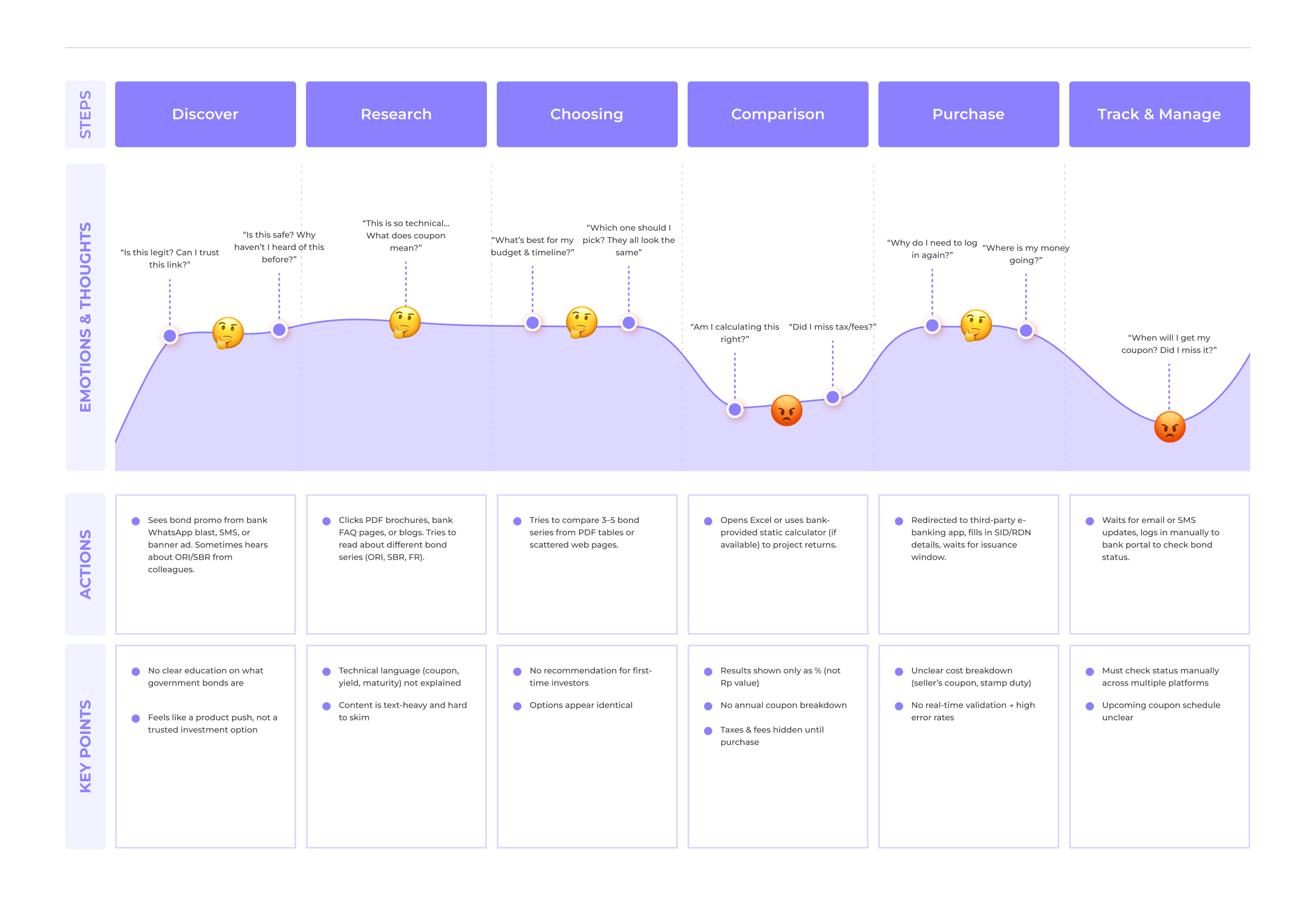
Before designing the Government Bonds feature, we needed to understand the end-to-end experience of retail investors. Bonds are not only financially complex but also involve multiple touchpoints banks, financial apps, manual spreadsheets, and even offline steps.

Based of all the resarch heres the 3 key findings of bond app

Users struggled with jargon: coupon, yield, settlement, liquidity. Result → hesitation & drop-off.

Other apps force users through multiple redirects (bank + RDN + government site). Result → frustration, high abandonment.

Other platforms only show a flat % yield, leaving users confused about actual payouts.
Government bonds are often perceived as complex and intimidating. Users struggle with jargon, face fragmented purchase flows, and lack tools to clearly understand real returns. To address this, we reframed the challenges into key How Might We (HMW) questions:
“How might we design a government bond experience that is clear, trustworthy, and aligned with users’ existing mental models, while ensuring regulatory compliance and driving adoption in Tuntun’s ecosystem?”
Rina (32, Civil Servant): Risk-averse, prefers deposits, confused by bond terms.
Dimas (28, Employee): Tech-savvy, curious, but can’t calculate real returns.
Use plain language and avoid jargon walls so users can quickly understand financial terms without confusion.
Build credibility with official government badges and transparent cost breakdowns that reassure users their money is safe.
Show real projected outcomes through bond simulators instead of only abstract percentages, making returns feel tangible.
Design the flow to mimic familiar deposit purchase experiences, reducing learning curves and making the process feel natural.
Based on survey responses and 8 participant in depth interviews & usability testing sessions, the design evolved across several iterations to achieve

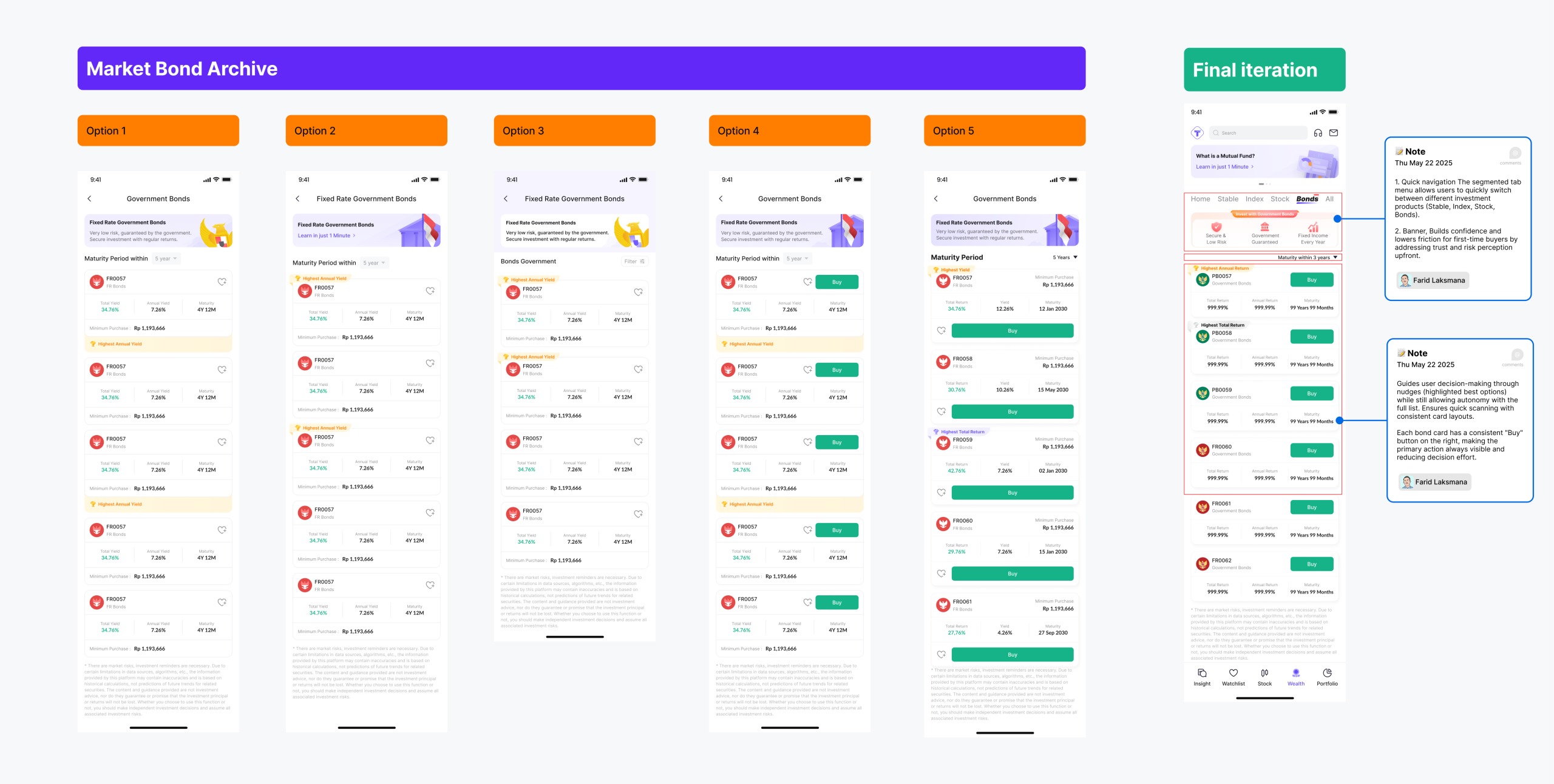
Initially, all products were listed equally, which slowed down comparison. After adding highlights, navigation became more efficient and confidence increased.
By applying our clarity-first strategy, we introduced highlighted products that surfaced key differences upfront.

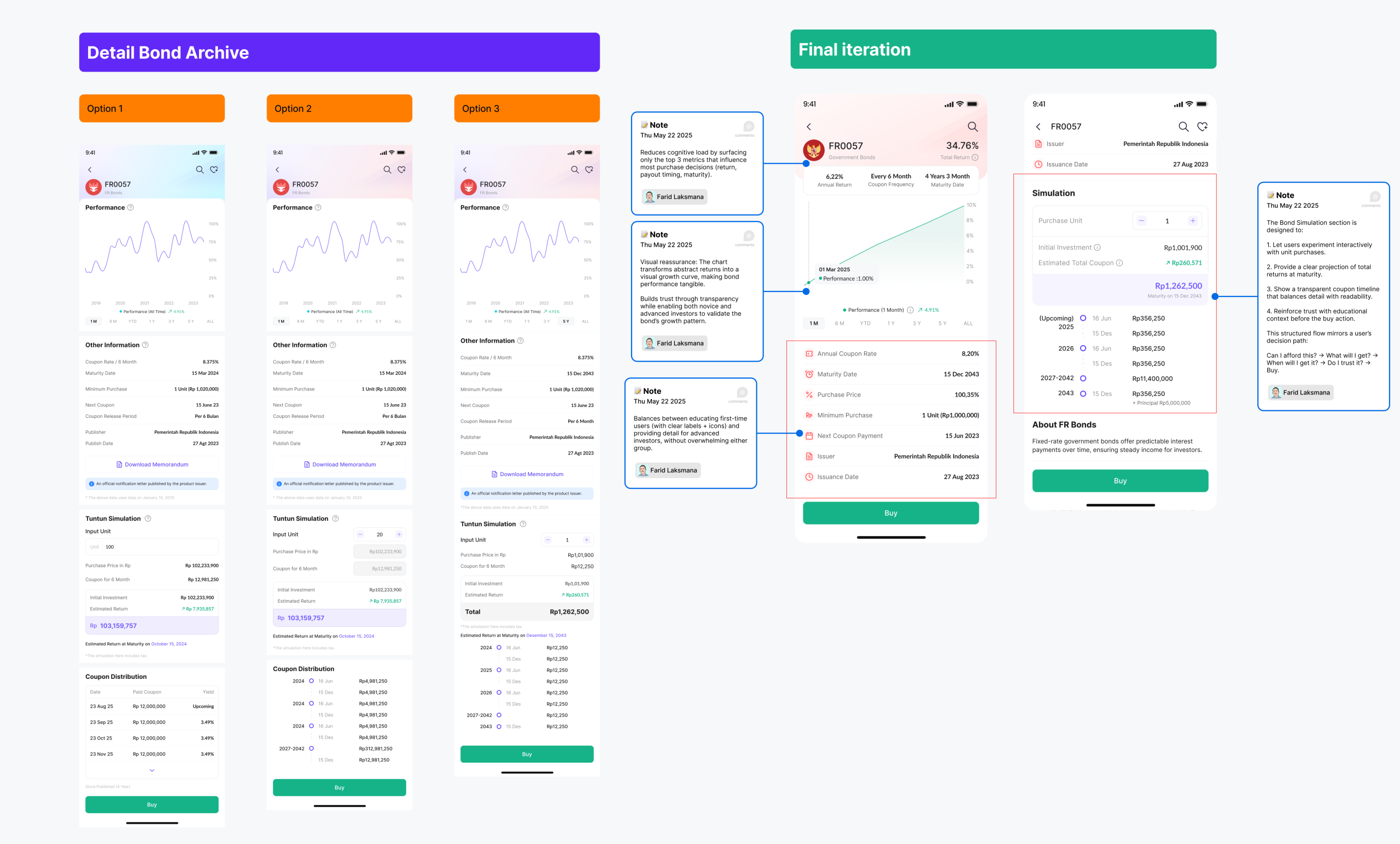
Data points were reorganized with icons, improved layout hierarchy, and a simulation that showed real transaction impact.
Clear breakdown with both essential information upfront and optional expandable details. Users favored the improved readability and felt more secure about their purchase. This directly reflected our simulation-driven strategy, transforming abstract numbers into tangible results.

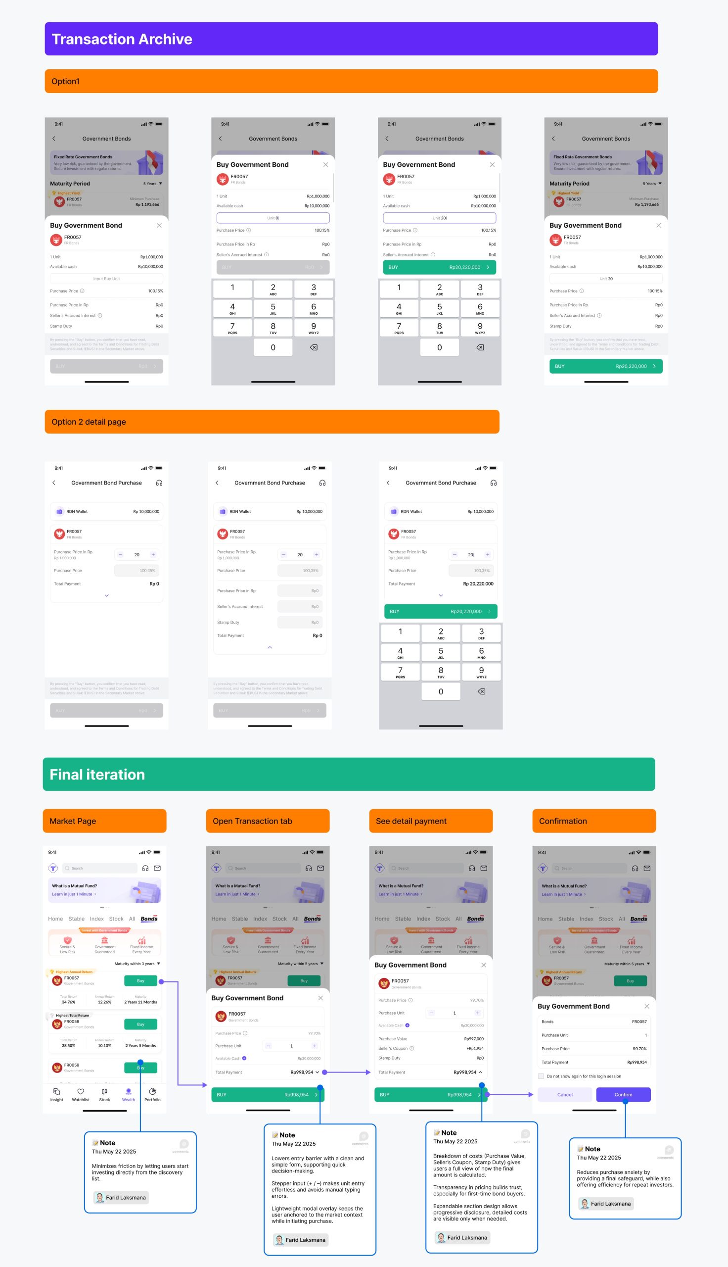
Simplified into a bottom sheet flow with expandable sections, so users only see what matters first but can open details if needed.
Simplified into a bottom sheet flow with expandable sections, so users only see what matters first but can open details if needed. This followed our mental model fit strategy, mirroring familiar purchase flows while reducing unnecessary friction.
The final design surfaced bonds in two entry points, a homepage banner and a dedicated tab. This dual approach made discovery intuitive for both casual and power users. Testing showed a 14.2% CTR from the banner, proving visibility drives adoption without adding complexity.
Glossary tooltips and progressive disclosure replaced jargon-heavy text blocks. Instead of overwhelming users, details unfolded in layers. This improved comprehension and aligned with our trust goal, as users clearly understood rates, terms, and costs before making decisions.
An interactive simulator transformed abstract percentages into tangible future income. Users could adjust investment amounts and instantly see projected payouts. This design made returns relatable and directly delivered on our strategy of showing real outcomes first.
The purchase flow was simplified into a stepped UI with transparent cost breakdowns and safe CTAs. Requirements like SID, RDN, and available funds were validated upfront. This mirrored deposit purchase flows, reduced anxiety, and boosted confidence at the moment of commitment.
The portfolio view highlighted net returns and upcoming coupon payments instead of price volatility. This reinforced bonds as a steady income product, closer to time deposits, making ownership feel rewarding and encouraging reinvestment.
The redesign increased task completion success to 92% and boosted user confidence, with 80% feeling more assured in making investment decisions. Average task time dropped by 30%, showing that simpler layouts and flows directly improved efficiency and trust.
When testing financial products, it’s important to understand users’ mental models and how they naturally process information. Transparency isn’t just helpful, it’s one of the strongest UX tools in finance, making users feel safe and empowered to take action.