01· Overview
Clarity in every investment move
✦ Background
Most retail investors in Indonesia rely heavily on trading signals from groups or influencers. While signals tell them what to buy or sell, users often enter too late, miss exits, or simply follow without truly understanding the reasoning. This creates frustration, lack of trust, and feelings of “gambling” rather than investing.
✦ Challenge
We saw an opportunity to fix this gap by creating a portfolio experience that doesn’t just show performance, but also delivers timely signals, transparent reasoning, and contextual guidance, helping users act with confidence, not confusion.
02· Role
Beyond UX
To bring this vision to life, I took on multiple roles:
- Research → uncovering user needs, pain points, and behaviors.
- Designing UI → shaping intuitive journeys that guide decision-making.
- Validation with users → testing solutions to ensure relevance and usability.
By combining UX design, product thinking, and behavioral finance insights, I aimed to transform a passive portfolio view into an active, trusted decision-making guide.
03· Defining Core Problem
How Might We & Success Definition
✦ How Might We Question
The real issue wasn’t portfolio tracking. The problem was users following signals without clarity or timing, leading to stress and poor confidence.
“How might we design a portfolio experience that delivers signals with reasoning, context, and actionable timing, so users follow with understanding, not blind trust?”
✦ Success Definition
We defined success not by how many charts or features we built, but by how much clarity, trust, and actionability we could deliver to users. Our portfolio experience would be considered successful if it could achieve these outcomes:

Increase Transparency
Users can see Tuntun’s trades + reasoning.

Provide Context
Each action explained in plain language.
Enable Actionability
Notifications arrive on time, relevant, and doable.
04· Research & Insights
Research Activities & Key Findings
✦ Research Activities
To deeply understand investor behavior, we combined qualitative and quantitative research:
- 10 in-depth interviews → with active retail investors (age 25–40, medium to high trading frequency).
- Competitor benchmarking → studying local apps (Ajaib, Bibit, Bareksa) and global platforms (eToro, Simply Wall St, Interactive Brokers) to spot gaps.
✦ Key Findings
This insight reframed our challenge. The issue wasn’t access to data; users already had that. The real problem was lack of clarity and guidance around decisions.
76% of users said they wanted to “follow professional moves” instead of interpreting TP & SL action.
“I see my numbers every day, but I don’t know when to buy or sell; it feels like guessing.”
ImplicationPortfolio needs to be more than a tracker: it must provide followable guidance.
82% said they would only follow trades if the reasoning was clearly explained.
“I don’t mind following trades, but I need to understand why. Otherwise, it feels like gambling.”
ImplicationEvery buy/sell action must be accompanied by a transparent explanation in the Investment Journal.
65% had muted finance apps due to irrelevant alerts.
“I get notified about price drops I cannot act on; it only creates unnecessary stress.”
ImplicationNotifications must be timely, contextual, and actionable, not spam.
05· UX Strategy
UX Goals
From our research, we learned that investors weren’t struggling with access to data, but with how to interpret and act on it. To solve this, we set four UX goals that directly addressed the pain points users had shared.
Clarity First
Clarity is the foundation of any good UX. Users should quickly understand what they’re looking at without extra effort. When information is too complex, users disengage or make mistakes.
Decision Enabling
Good UX doesn’t just present information, it supports decision-making. Users often need guidance, context, and cues that help them take the right action at the right time.
Transparency
Transparency builds trust. When users understand why something happens, they feel more in control and are more likely to engage with the product. Hidden logic or unclear changes erode credibility.
Engagement
Engagement should be meaningful, not manipulative. The goal is to keep users returning because the product genuinely helps them, not because it demands their attention.
06· Design Process
Journey Mapping & Key Solutions
✦ Journey Mapping
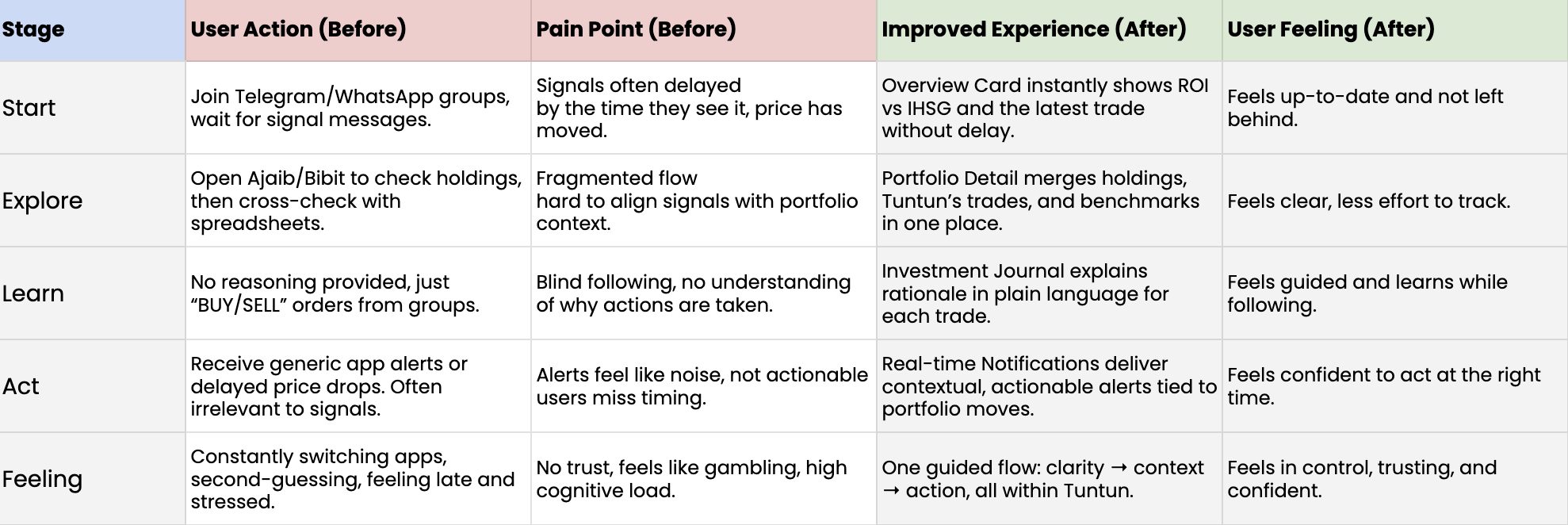
We mapped how retail investors currently manage trades:
• Receiving trading signals from Telegram/WhatsApp.
• Checking prices and portfolios in separate apps (Ajaib, Bibit, etc).
• Logging or validating trades in personal spreadsheets.
This fragmented flow led to late entries, missed exits, and zero understanding of why actions were taken.
This scattered flow revealed the pain points: data silos, lack of transparency, and zero actionable insight.
✦ Results
Each of these ideas aimed to bring users from confusion → guided clarity → confident action.
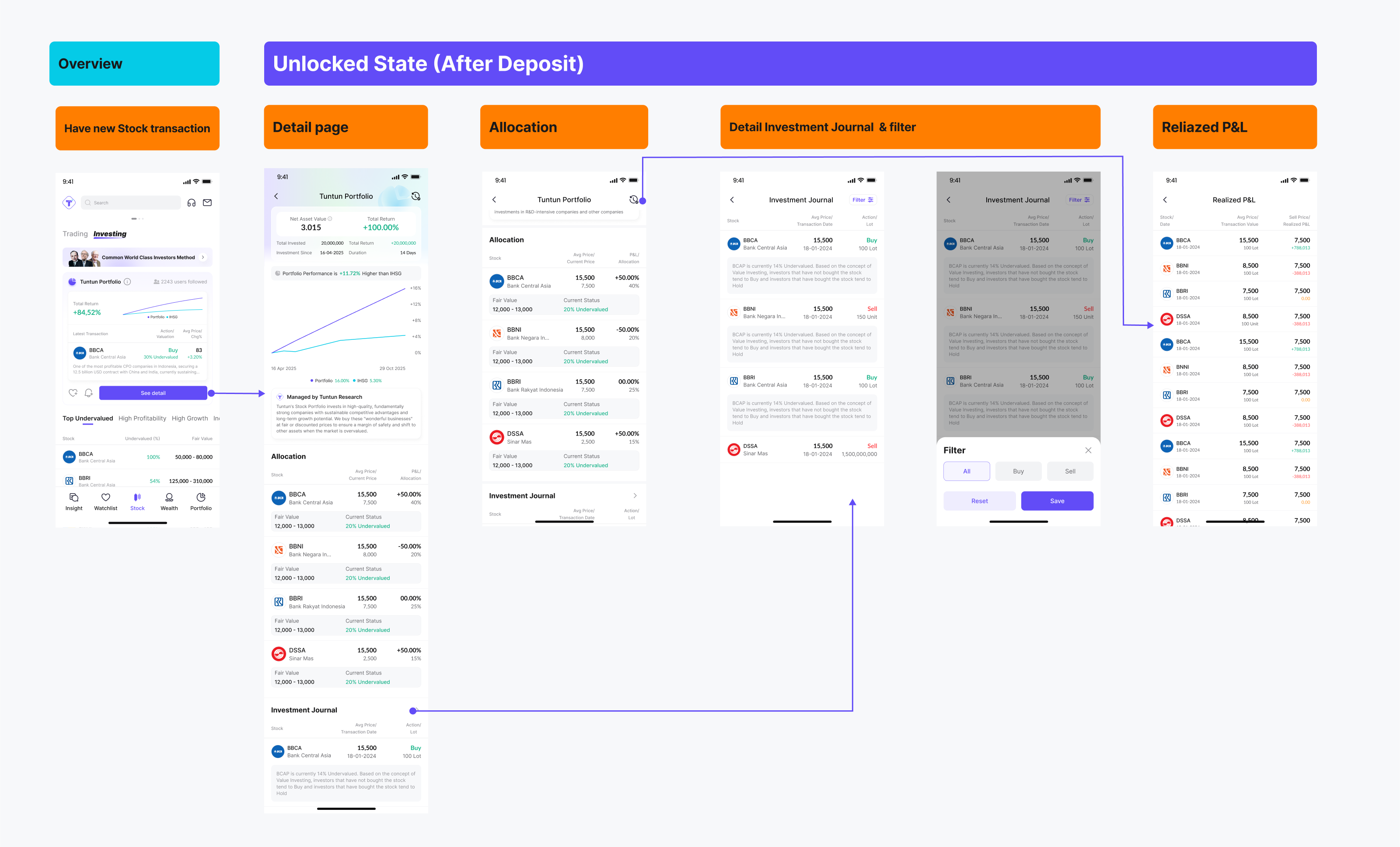
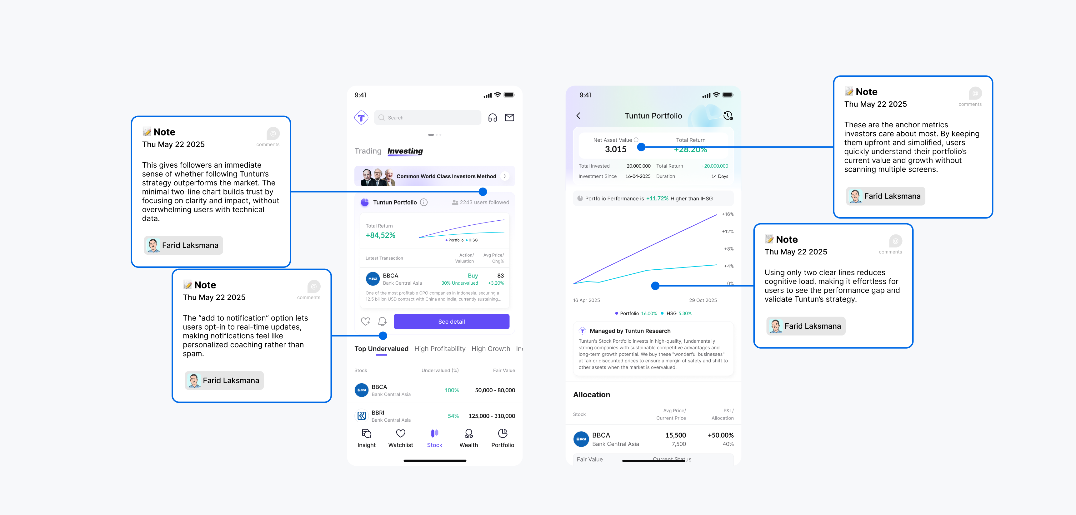
Overview Card & Portfolio Detail Page
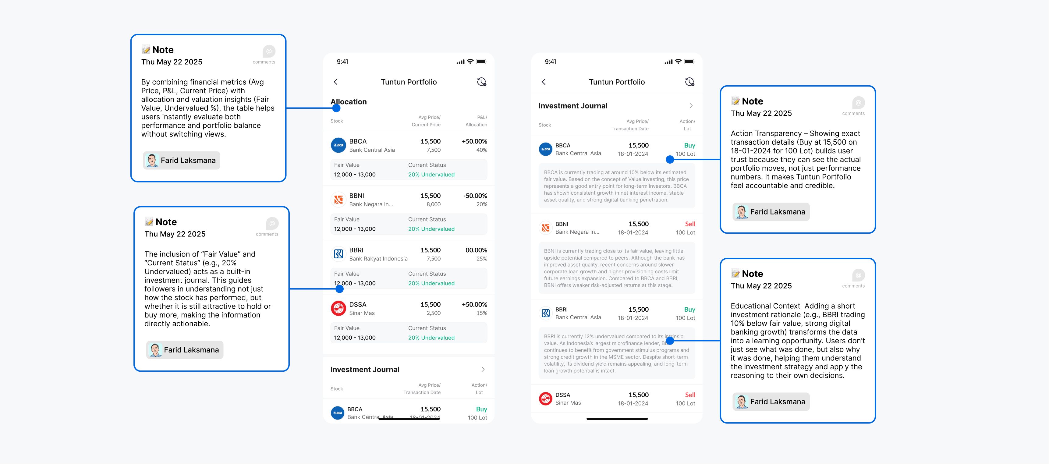
At the homepage, an overview card summarizes the most important metrics (ROI, a mini chart of portfolio performance, and the latest transaction). This allows users to instantly gauge how they are doing compared to the market (IHSG) without diving into multiple screens. For users who want more depth, the detail page expands into allocations, price movements, and annotated notes that explain the reasoning behind each trade.
- ✔ Clarity First: by giving a quick-scan view that simplifies complexity into a snapshot.
- ✔ Transparency: by exposing not just numbers, but also the “why” behind each decision.
Through this combination, users are empowered to build trust in the product and confidence in their own decision-making process, aligning with the overall UX strategy of reducing cognitive friction while enhancing interpretability.
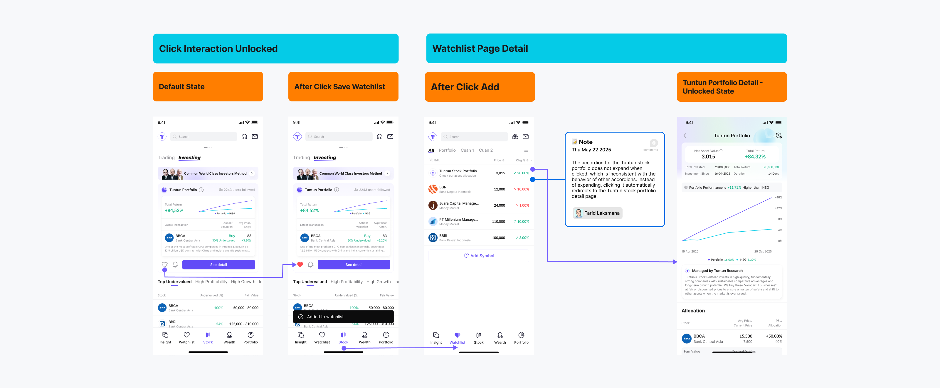
Watchlist Feature
We introduced a Watchlist feature. Users can now save and organize potential stocks, revisit them later, and easily compare performance in one centralized place. This mirrors real investor behavior and significantly reduces cognitive load, since users no longer need to mentally juggle which stocks they are considering.
- ✔ Decision Enabling: by giving users a structured space to evaluate potential entries before committing.
- ✔ Clarity: by consolidating “consideration assets” in one place instead of scattered mental notes.
As a result, Watchlist transforms passive interest into actionable insight, aligning with the UX strategy of supporting natural investment behavior and guiding users toward better-timed, more confident entry decisions.
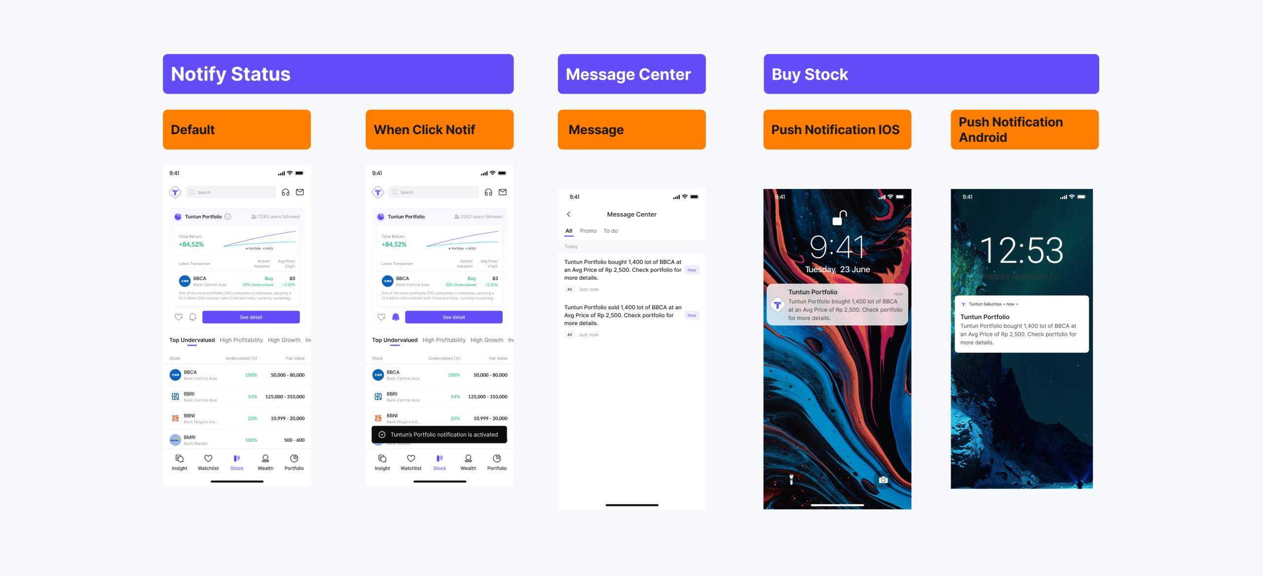
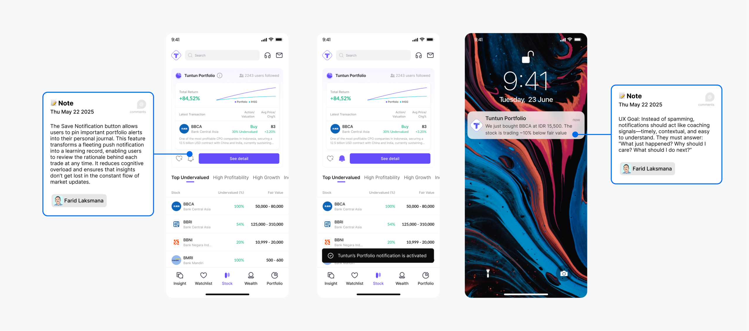
Actionable Notification System
We redesigned the notification system to be event-based, contextual, and actionable. For example, when the portfolio executes a buy or sell, the user immediately receives a short, clear notification with just enough context to act if needed. Instead of constant “market spam,” alerts are now focused on events directly tied to the user’s portfolio or watchlist.
- ✔ Engagement: by keeping users in sync with critical actions at the right moment.
- ✔ Decision Enabling: by ensuring alerts are not just informative, but also actionable, helping users respond in real time.
- ✔ Transparency: by making sure users understand what happened and why, reducing uncertainty.
The result is a notification system that guides rather than overwhelms, reframing alerts from a source of stress into a trusted support mechanism. This aligns with our UX strategy of maintaining engagement while reinforcing user trust and confidence in their investment journey.
07· Final Solution
Final UI Showcase & Impact
Impact
- 🚀 76% of users felt more confident following trades when explanations were provided.
- 🚀 68% reacted faster thanks to timely notifications compared to Telegram/WhatsApp signals.
- 🚀 72% trusted the portfolio more when performance was benchmarked against IHSG.
Lessons Learned
We learned that users don’t need more signals or raw data, they need context they can act on. The combination of transparent explanations proved to be a strong trust builder. Most importantly, when users understood the why behind each trade, they did not simply follow; they learned, engaged more deeply, and stayed longer.